 Here is the official album cover of Boy band JLS. The album is called "JLS"
The cover's design is simple but sophisticated and stylish. This is represented by the majority of the cover being in black and white except the running order of colours which is a representation of each band member- the order of colours matches the order of the band members from left to right. This is an recognisable feature that has been with the band since they were spotted on the talent show the Xfactor. The colours of each of the band members being the unique selling point of the band, which has stayed with them as they have grown as artists, so that the audience can recognise them using the limited colours. This shows that the band has grown along with their status and fame, as they have become more sophisticated, pop sensations and global superstars which the album cover clearly represents. Their band name and album title is also big, bold and in the centre to display who they are and what they are about.
Each member is staring directly into the camera, all with straight faces to show that they are serious about what they do and also to add to the sophisticated effect. They are all dressed in the colour black- which is yet again a very smart/classy colour in relation to this theme and we see evidence of symmetry in their clothing and positioning. The two furthest members out of the four are wearing collared shirts, whilst the two members in the centre are wearing round neck shirts. The two centred members are also wearing chains whilst the other two members are not-to help show individuality as well as group membership. Clothing plays a big role within the group, as it is again one of their most recognisable features. How they are dressed on the cover, is mostly how they are dressed in each of their music videos- showing they want to remain the same in all mediums.
To conclude, this cover is very effective as it represents both the JLS from Xfactor which everybody knows them from and the JLS they have become through their success.
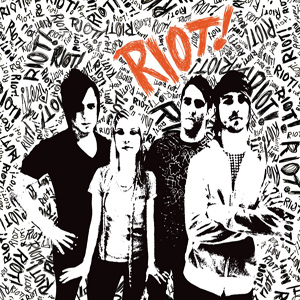 Here is the official album cover of band Paramore. The album is called "RIOT!"
As the cover is prodominantly in black and white it is hard to go into detail about their clothing and style- but what we can see is that all band members are casually dressed in the typical style of the genre.
The band members are positioned close together to show that they are a group- "as one", each in a stance to represent that they have attitude- which links directly back to the word "Riot" and the whole theme of the cover.
The band is male dominated, however the lead singer is female showing the equality in the band between males and females.
To conclude, the whole cover/theme is brash and bold which works well for this band but it is not an idea that particularly appeals to us.

The cover's design and use of colours has clearly been used for a purpose. For example, the background is effectively a whitey/grey to bring out the colour in the girls' dresses/clothing, which contrasts with the girls' black tights and black shoes. Each band member is wearing a different colour- which could indicate that they are all individuals, with different personalities and interests. The clothes/dresses have been purposely made to appear sexy so that the audience are aware that not only are the girls good singers, but they are a hot girlband too.

Think about the core target audience for each product.
ReplyDelete1) Who is the core target audience for 'Paramore?'
2) What would the core target audience for The Saturdays and JLS find off-putting about 'Paramores' image and style?
3) How can you combine the 'edginess' and 'danger' of Paramore with the clean and safe look of The Saturdays and JLS without alienating/putting off your core target audiences?